

Coda Dashboards: Let's Get Insightful!
The Story Behind the Data
Creating effective dashboards requires understanding "the narrative within the data." Dashboards provide valuable insights for decision-making across industries. Rather than simply presenting numbers, successful dashboards use tables, formulas, and charts to tell a meaningful story through context and narrative.
Dynamic Data Manipulation
Dashboards function best when they enable action. "Filtering and sorting data is essential to having dynamic dashboards." Coda allows real-time data interaction and multiple visualization perspectives including charts, tables, and cards, enhancing dashboard versatility.
Crafting Compelling Charts
Effective chart creation techniques were demonstrated during the webinar. Leveraging graphs and canvas controls produces visually engaging, informative dashboards. However, Coda charts have a notable learning curve requiring attention to configuration and presentation details.
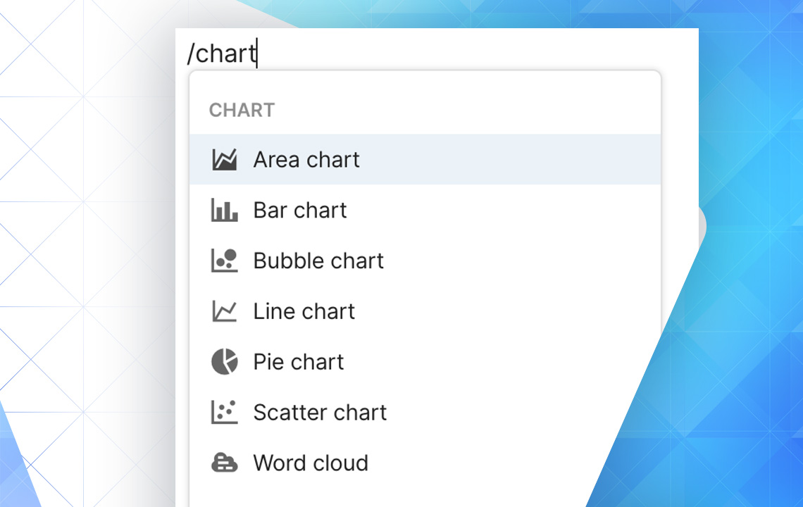
Making a Chart View
Not all data suits chart visualization. Evaluate whether data types align with specific chart formats before proceeding. The process begins by typing "/chart" in Coda's canvas.
So Many Choices!
Chart customization options include:
- Axis/Values - Summarize and select data for visualization
- Aggregate Values - Combine duplicate values into single data points
- Segment By - Compare data types
- Orientation - Vertical or horizontal display
- Range - Exclude outliers via minimum/maximum values
- Vertical Axis Scale - Linear or logarithmic spacing
- Stacking - Display similar values together
Make sure you have a clear idea of what data you want your chart to visualize.
More Useful Coda Resources by Simpladocs
Recommended resources include 30 Days of Coda (free resource) and The Coda School (comprehensive mastery course).
Want to read more?